GelaSkins/Product Design Building Better Information Architecture
Context
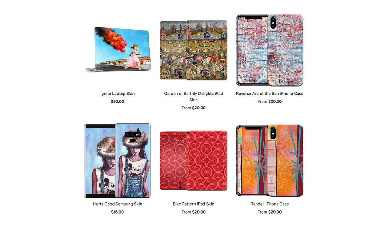
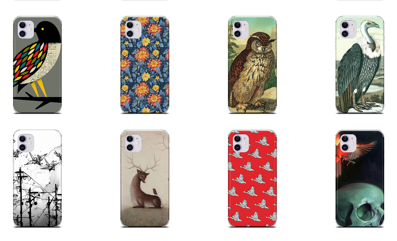
GelaSkins is an e-commerce company running on the Shopify platform. They manufacture made to order laptop skins and phone cases, printed with licensed artwork or customers' own images. They boast a collection of over 2000 pieces of unique artwork.
The goal for the project was to update and improve the site as a whole, both visually and functionally. This was achieved by constructing a new UI and new brand creative, improving user experience and navigation optimizations, and optimizing existing information architecture.
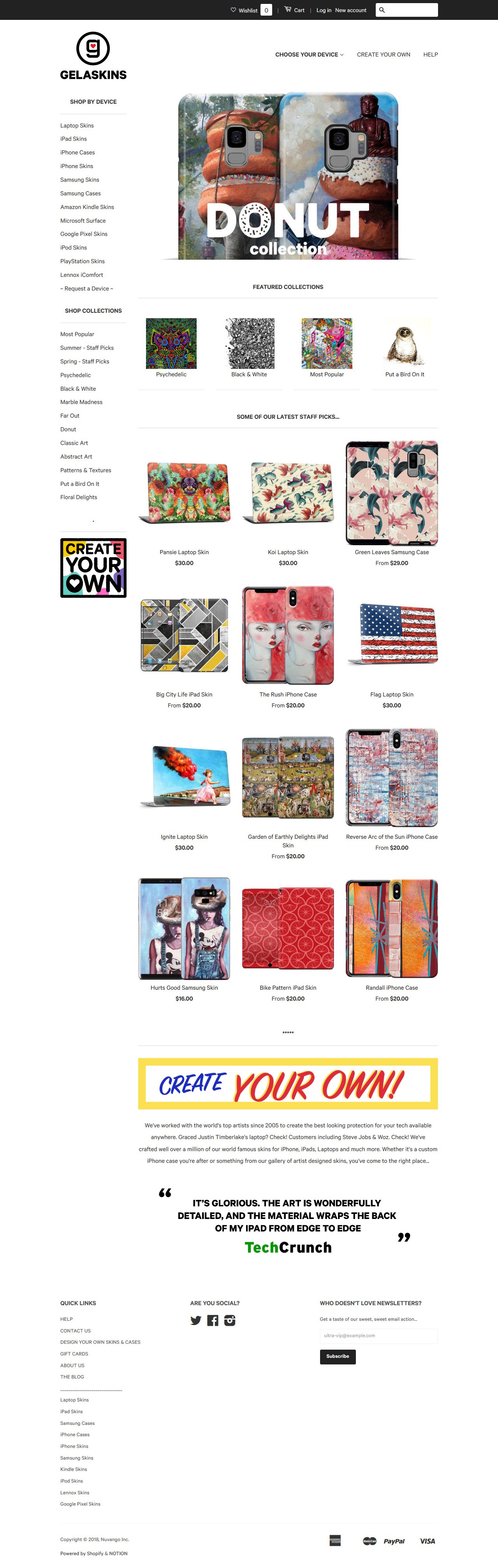
The finished site is currently live if you want a sneak peak at the final product.
I used Dan Brown's design discovery framework to inform the design process of the project. Below is his design discovery chart, which gives a kind of bird's eye view of the framework. I'll be generally following it's conventions for this case study.
*Footnotes for words, events or terms that may require more information will be notated with a superset numeral like this. Click it to view, click again to hide or hit the X.
The Hero's Customer's Journey
Gathering Data
Before diving into visualizations our team met with stakeholders to gather initial impressions on their goals for the project and any specific issues they had with the current site. We also interviewed customer service and production staff members regarding any problems they had encountered. These were our takeaways;
- Goals
- Freshen up the site visually and make it more intuitive to use
- Make the artwork the star of the site
- Increase visibility of the Create your Own tool
- Problems
- Customers were having difficulty finding products relevant to them
- Customers were missing important navigational tools
We built a map of the current site to get a better grasp on the customer journey and any pitfalls they might be encountering. Taking into account what kind of products were being displayed and how they were being organized.

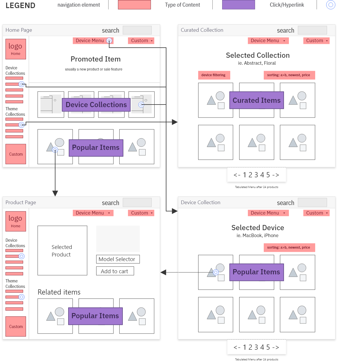
Our main takeaways from our sitemap and some initial assumptions were
- Popular items were promoted on almost every page - we also noted these products were often the same on every page
- After selecting a device there was no control for filtering artwork, forcing customers to browse a tabulated catalog
- Curated collections were the only area that offered the customer some filtering control
Building upon our findings we wanted to see how customers were using the site first hand. Using the GelaSkins staff we gave members instructions to find certain types of products on the site as quickly as possible. We supervised these tests to see first hand what kind of problems they encountered.
- Search was only returning results based on artist name and artwork title, Which was frequently inadequate and leading to frustration.
- Navigation elements weren't clear enough, sometimes being missed entirely
- Collections didn't cover enough of the potential interests
As a secondary task to try and elicit a less mechanical and spontaneous result we asked participants to find something they would buy. We noted that participants;
- Resorted to browsing the tabulated popular products collection hoping to find something
- Were Frustrated by limited filter options and that the filters available couldn't be used together
- Missed the lack of previously viewed products they were accustom to on other e-commerce websites
We also took a look at unit sales. Based on our gathering efforts so far, we assumed products featured in the auto populated popular products (say that 5x fast) collections would be significantly outselling everything else.
*disclaimer Our assumptions were correct, artwork featured in the popular collections sold on average 100X more and products featured in other collections averaged around 18X more. There was also a surprising amount of artwork that had only sold between 0 to 3 units, these products were essentially buried never to be seen again due to the sites architecture. We also noted descriptive artwork titles would on average yield more sales. We attributed this to the fact these products would have been more “findable” with the current search implementation.
What Does it All Mean?!
Processing the Data
Pulling our research together we drew conclusions on the particular problems that were causing frustration and potentially lost revenue on the site.
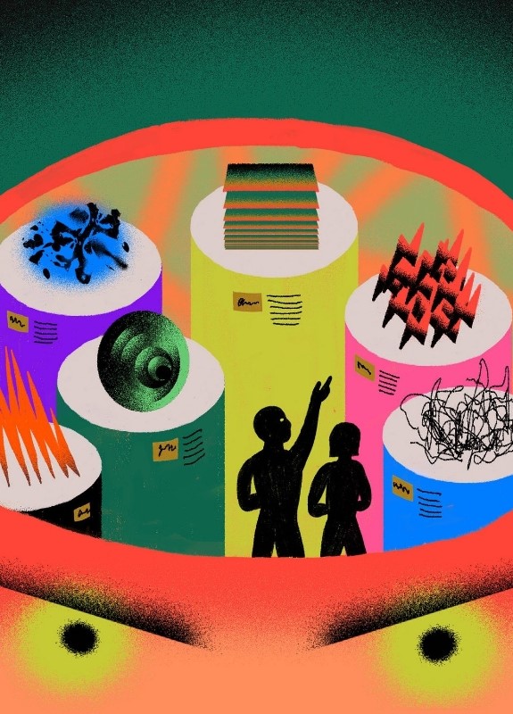
GelaSkins was devoting a large portion of the site to the promotion of popular products. While heavily promoting popular items isn’t necessarily a bad thing, for GelaSkins it completely diminished one of their greatest assets, variety. To put things in perspective there were a potential 2000+ pieces of artwork that were rarely or never being seen by customers. This was unacceptable.
GelaSkins had a look. While in theory they provided artwork for everyone in reality thanks to the persistance and visibility of popular items combined with how difficult it was to find other artwork a certain look was being promoted and attributed to the brand. Potentially driving off customers. The site also felt stale, many of the same popular products had been on display for years.
These problems could be condensed into three particular areas of focus, nick-named F3.
- Fixed
- Customers were seeing the same products
- Filtering
- Customers were having trouble narrowing their search
- Finding
- Products were hidden and unsearchable
These areas represented the major hurtles that needed to be overcome to achieve the goals of the project.
What Works for You?
Exploring Solutions
Using F3 and a new understanding of the problems facing our customers we came up with the following proposals;
To make the website feel more relevant and personalized we contemplated implementing a persistent device selection state. If the customer selects an iPhone the website defaults to displaying iPhone products. This would ensure that thumbnails featuring images designed for other products (laptops, tablets, samsung) would be filtered out. Unfortunately we didn't have the resources or development expertise to implement such a feature.
To help customers find artwork and easily switch between devices we proposed changing the catalog to use artwork as the nucleus product. The current nucleus product included a combination of artwork and device, making it frustrating to locate artwork on other devices. Unfortunately Shopify couldn't support the sheer amount of variant products required
To showcase the variety of artwork the site boasted, we suggested a new search prompt focusing on the site's ability to accommodate any customer's taste/style. This approach would greatly improve the filtering and finding of products on the site and could be easily implemented with our existing search engine but would require an extensive cataloging of the existing artwork.
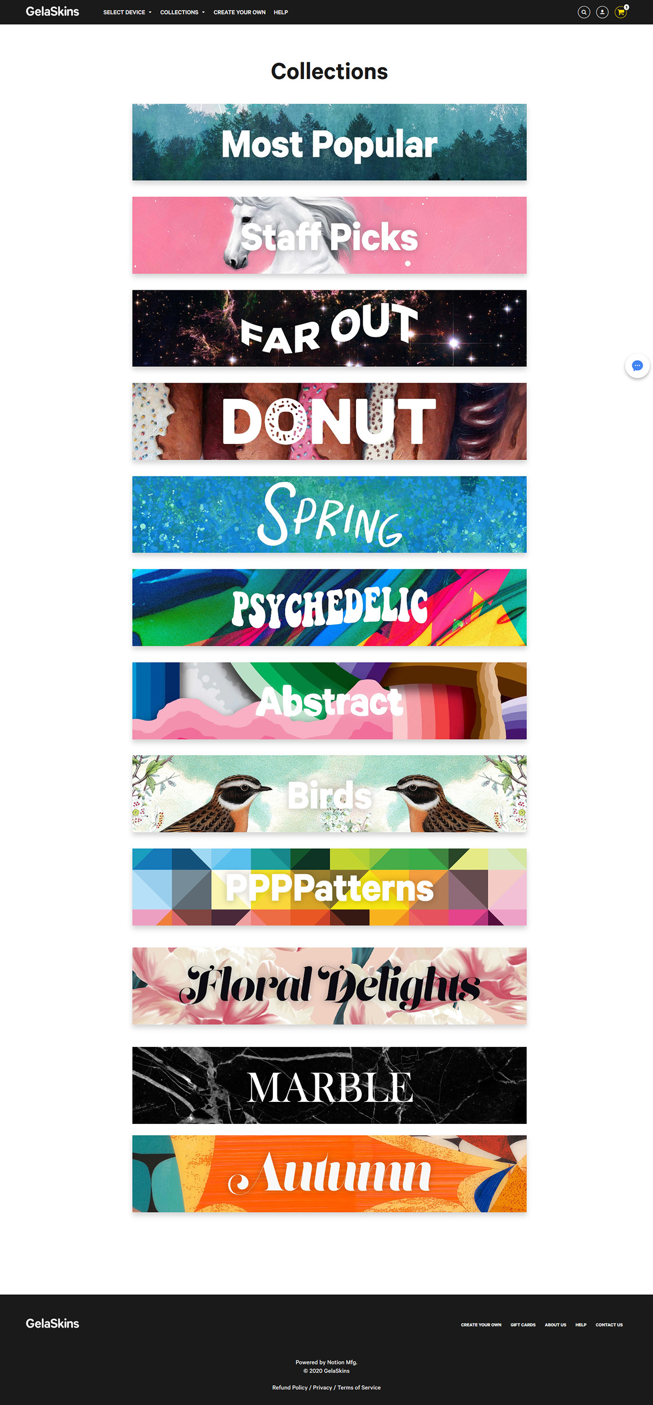
To entice customers and give them a better sense of the range of product offerings at a glance and to prompt potential search queries, we proposed creating additional curated collections and a collection index page with rich vivid thumbnails. This approach could be easily implemented and targeted the Fixed problem while also assisting the proposed search feature.
Taking a page out of the fashion handbook we recommended seasonal collection rotations at a minimum. In an effort to keep the site feeling fresh, this tried and true method of keeping customers interested and engaged was a no-brainer.
Priceless Artwork Found!2000+ pieces of artwork recovered after years hidden deep inside tabulated catalog menu
Focusing Our Efforts
From the solutions proposed we decided to focus on the improved search and curated collections. In order to implement a useful sophisticated search tool we knew the first thing we would have to tackle was the severe lack of data tied to existing artwork if we wanted to remedy F3. We had some discussions with the CTO and managed to come up with an agreeable solution, adding “tags” that were tied to the artworks metadata. Without getting into too much technical detail the tags would expose more image data to filter and search tools. To figure out what kind of information would be most useful for filtering and searching, we brainstormed with our team and the GelaSkins staff regarding the type of phrases customers might use when searching for artwork. We then grouped them as we noticed patterns emerging.


We took all the phrases and phrase groupings and narrowed them down into six major catagories. We then used the catagories to define our tagging parameters. The catagories we identified were as follows; Theme, Mood, Art Style, Colour, Primary Subject, X-Factor (anything that wasn't in the first five catagories but was worth mentioning).
-
- Title
- Exmple-img-01.jpg
- Theme
- Science, Innovation, Turmoil
- Mood
- Angry, Violent, Frustrated
- Art Style
- Geometric, Digital, Simple, Noise
- Primary Colour
- Red, Orange, Olive, Dark Green
- Primary Subject
- Scientists, Brain, Eyes, Laboratory
- X-Factor
- N/A
-

- Title
- Exmple-img-02.jpg
- Theme
- Desert, Desolate ,Landscape
- Mood
- Bleak, Bright, Calc
- Art Style
- Fantasy, Realistic, Photographic
- Primary Colour
- Fuchsia, Pink, Purple, Violet, Orange
- Primary Subject
- Desert, Tree, Dead Tree, Landscape
- X-Factor
- Desktop Wallpaper
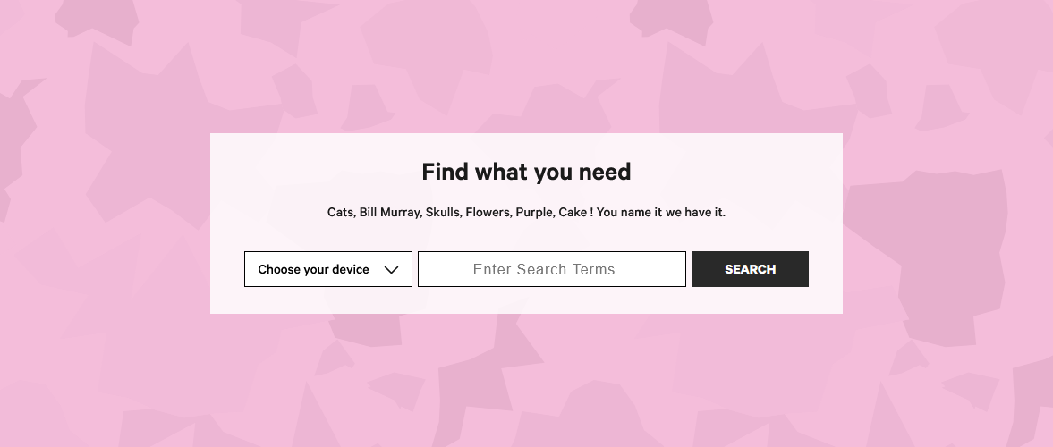
These catagories provided useful filtering and strong searchable criteria that increased customer satisfaction when browsing our artwork catalog. With the addition of hundreds of new tags we added device filtering right in the search bar so customers would immediately find artwork on relevant products and added suggestions to the copy so customers could get an idea of the types of things they could search for (fig5).
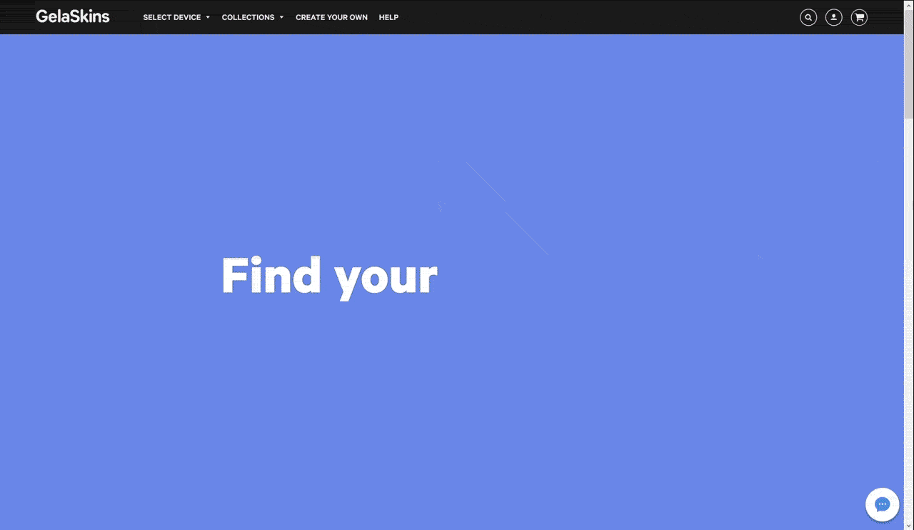
With the updates, search became a flagship feature and the most effective way to browse GelaSkins. We promoted it prominently on the homepage with a massive animated full height header (fig7) proudly stating “Find your ____”. In doing this we could promote rotating products and inform customers on the variety of things they could search for. The thinking behind the “Find your ____” tagline was to personalize the experience for every user and highlight the site’s ability to accommodate a broad range of interests. As a bonus the catalog was now searchable internally, which reduced the time it took for marketing to create unique collections, feature seasonal artwork and much more.
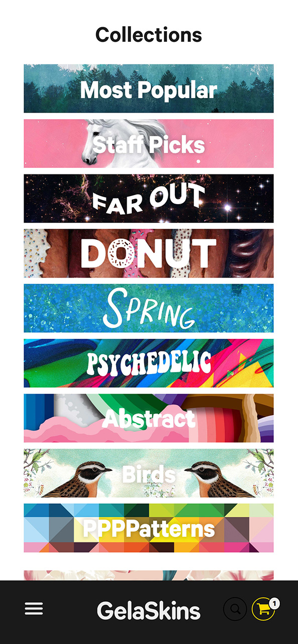
We realized that not every user knew exactly, or even generally, what they were looking for so search wouldn't be as useful for them. Leading to our second solution, curated collections, we were able to account for these users by using the new tags to build collections showcasing some of our more popular themes (floral, abstract, patterns, pop-surreal), promote seasonal images (spring, valentine’s, donut day) and even some more novel artwork (psychidelic, unicorn, Bill Murray).
Make It Clean, Make It Cool
Updating and Improving the UI
When customers first entered the website, they were initially inundated with unnecessary information and no clear path to finding what they wanted. While improving search and collections was addressed we still needed to take a look at the sites navigation elements and bring the artwork to center stage. To ensure the artwork was the main focus, a minimalist approach to the design was taken. Originally the site was overly compact and there was a lack of information hierarchy, it felt busy and lacked direction. We introduced a simple design with minimal colour, so as not to compete with the the artwork, and a light, bright colour was reserved for navigational elements, making them easy to find and use. To further decrease the clutter of the page, the navigational elements were moved from the sidebar to the nav bar so more of the page could be dedicated to showcasing artwork.
We added collections and device selection to the NAV along with create your own and a link to the new help section
As well you'll notice we went with the bottom fixed nav for our mobile layout. With the increasing size of mobile phones and a large number of our customers sporting the latest tech it's just good UX.
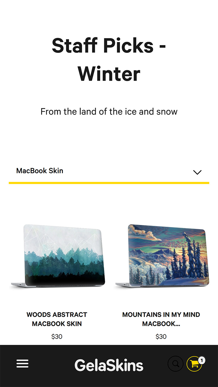
One design element that contributed greatly to the business of the page was the original design of the artwork thumbnails. When customers buy a case or skin from the site they are also given a desktop wallpaper of the artwork they bought. The original thumbnails included both a picture of the artwork on the skin/case as well as an image of the artwork on the device as a wallpaper. This meant that there were two pictures of the same piece of artwork in a single thumbnail. This decreased the size of the artwork and made the thumbnail confusing and busy. We decided to remove the front of the device displaying the wallpaper and simply showcase the artwork as a skin/case, the real product the customer was purchasing. By removing the wallpaper image we were able to enlarge the artwork and highlight the real beauty of the piece, concept being to give the feeling of a gallery with artwork framed on a white wall.
Bringing it All Together
The GelaSkins brand update ended up being influenced heavily by our design discovery and UX improvements, we were able to create a meaningful holistic aesthetic that directly tied into the new search focused navigation.
Final Notes
After shipping GelSkins stakeholders were so happy with the results that they adopted the "Find Your ____" tagline in their branding and marketing campaigns.
Sales increased and CSR was happy to report less frustration with the website, attributed to the ease of navigation and the updated FAQ.