Notion.mfg / Product DesignNotion Customizer v2
Some context to get started
Notion.mfg is a vertically integrated boutique print warehouse, serving mostly B2B clients. They have production capabilities for a variety of merchandising products including; Tech Skins and Cases, T-shirts, Cut and Sew apparel, Cut and Sew accessories, and traditional fine art prints and posters.
The Custom print App (aka: the Customizer) along with the Website were developed in an attempt to break into the consumer market.
Footnotes for words, events or terms that may require more information will be notated with a superset numeral like this. Click to view, click again to hide or hit the X.
Product Goals
Before starting on the project, the stakeholders and I discussed what they wanted to accomplish with the project in order to gather a set of primary goals to work from. Setting initial goals kept the project focused and lead to quicker development in the long run. In the end it all boiled down to 5 items:
- Let the users image breathe. It should be the most important thing in the viewport
- Bring the app in line with existing brand aesthetics
- Make the UX more intuitive, specifically for users unfamiliar with print media
- Address pre-existing pain points
- Implement a new background colour fill feature
At the root of these goals are 3 + 1 product design principles:
Simplicity v. Creativity, Clarity v. Confusion and Usability v. Frustration. The plus 1
represents
added functionality, features, content or whatever and then applying the 3 goals to
each +1.
Simplicity v. Creativity
In order to achieve our goal of keeping the user’s image the focus, we took a subtle approach when designing the UI. We decided to use a muted palette, predominantly of white/grey and teal/cyan, with muted brand colours to highlight primary action elements.
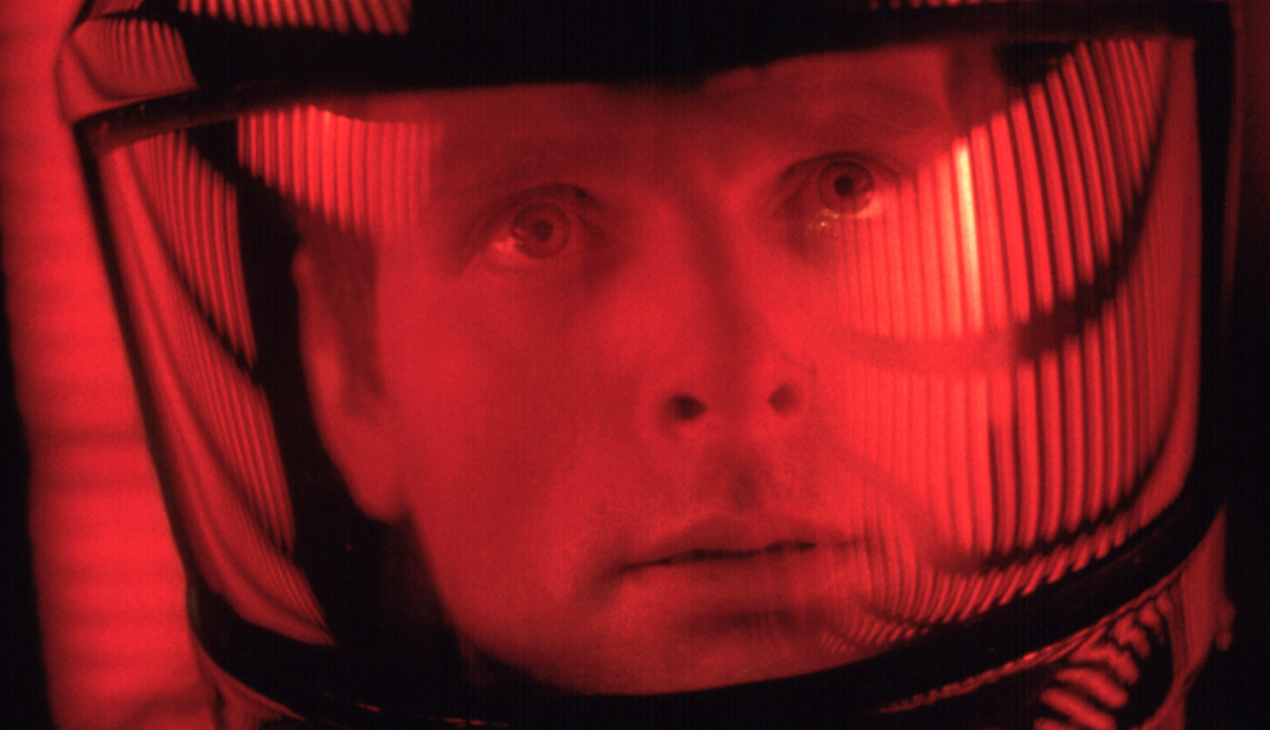
Using saturated colours on dark backgrounds can make a user feel anxious and uneasy. Do you feel anxious Dave?
For our font choices we initially attempted to
use our brand fonts but quickly
found them inappropriate. Sabon Next was too opinionated and went against our primary goals
while Harmonia Sans was simply too wide for a condensed UI like a tool palette. After a day
or
two of scouting around for new fonts we landed on Rubik as the heading
and primary button font. Rubik in particular has a softness to it thanks to its slightly
curved terminals.  It
also has a bunch of weights, I was sold. A quick note on choosing Rubik as a button font.
It’s slight roundness
allowed us to use square buttons without appearing to formal. Segoe UI was chosen for
everything else. It has a very
utilitarian feel, perfect for presenting information clearly, it has plenty of weights and a
condensed family, checkmark. When paired together these fonts were both direct and inviting,
riding the line between business tool and user app. We felt these new fonts still
represented
the brand while not fading into the background, which satisfied our initial goal of letting
the user's artwork be the focus.
It
also has a bunch of weights, I was sold. A quick note on choosing Rubik as a button font.
It’s slight roundness
allowed us to use square buttons without appearing to formal. Segoe UI was chosen for
everything else. It has a very
utilitarian feel, perfect for presenting information clearly, it has plenty of weights and a
condensed family, checkmark. When paired together these fonts were both direct and inviting,
riding the line between business tool and user app. We felt these new fonts still
represented
the brand while not fading into the background, which satisfied our initial goal of letting
the user's artwork be the focus.
With the atomic UI elements defined we looked at the existing structure and removed any unnecessary graphic elements and boxes/enclosures; Marie Kondo would have approved, I’m sure. This gave the digital space a more airy and open feeling. Letting the user focus on what really matters, their print.
 Upload - Desktop 1366@2x.png)
Unnecessary elements were stripped away, giving the customer room to asses the product they were creating.
Clarity v. Confusion
While designing the UI we were always scrutinizing the UX. At one point we were playing with the idea of a completely symbol based tool palette, which was better UI but ultimately bad UX.
We weren’t building an application that the users would be visiting consistently enough to gain a familiarity with our symbols, therefore, it was unrealistic to expect our users would understand them at a glance. It’s always alluring to simplify an action by representing it with a symbol, and sometimes it’s 100% the right choice, but it must be done for the right reasons and in the right context. An icon may seem obvious to some, but more times then not, it’s actually not obvious at all. Adding labels was an easy way for us to remedy this common UX problem. The UI ended up being a little busier, but in the end it was a very minor visual concession for a large bump in user accessibility.


Our next mission was taking a look at existing button language. We found adjustments we could make to more accurately describe one of our button's action. Initially, the button read SAVE and would send you to the next surface or the cart when clicked. This was confusing since clicking the button did not actually save the product. We updated the language to better reflect what you were actually doing, going to the NEXT print surface or FINISHing your product. We also added animated state styles which directed users on what to do and where to go after they had completed the primary task. The new flow would follow the diagram below. 🡓
 →
→
 →
→
 →
→

 UI Elements - Symbols@2x.png)
 UI Elements - buttons@2x.png)
 UI Elements - buttons 2@2x.png)
Most symbols are taken from Shopifys polaris pattern library.
Usability v. Frustration
Usability to me is the constant struggle of preventing invisible barriers from causing users to have frustrating experiences. They are usually relatively easy to knock down, the difficult part is identifying them in the first place. I mean they’re invisible after all.
While working on the Notion App and from previous experience with GelaSkins we had identified a lack of print knowledge as a significant barrier when making the decision to order a printed product. Questions concerning users included: “Is my image the right size?”, “Will the colour turn out right?”, “What format should it be?”
We dedicated a large section of the tool palette to addressing this now visible barrier, by adding inline image upload guidelines and colour profile information. We implemented these guidelines using pre-existing print substrate data. I know that was probably confusing, in short, our app already had access to the helpful print data we needed, so it was just a matter of revealing it to the user. Leveraging this we were able to inform the user of the exact dimensions best suitable for their image.
We added an inline help link to the top nav, which directs to a long form FAQ on our website. The FAQ answers common questions and uncommon issues users may have in much more detail.
Warnings are a great way of dealing with problems you expect to arise. For us we expected errors with image manipulation. The warnings acted as flexible guardrails informing the users when they took an action that would affect the quality of their print, such as stretching the image to a resolution less then 300dpi. We opted for 3 events that would trigger a warning:
- The image didn’t fill the print area
- The image was stretched to a resolution less then 300dpi
- The image was stretched to a resolution less then 150dpi
We rewrote the copy for our warnings to be more explicit in their language removing words like may or might and added relevant information links directly in the warning window.
 Upload - iPhone 6-7-8@2x.png)
 Upload Expanded - iPhone 6-7-8@2x.png)
We let the user know recommended print sizes immediately in the upload tab
 Warning Placement - iPhone 6-7-8@2x.png)
Included an always visible help tab conveniently located above our warnings
 UI Elements - Warnings@2x.png)
Adding Features
The background fill feature allows a user to add solid colour fills to the print substrate. The feature would be useful in cases where someone has a transparent PNG of their logo and wants to print it on a skin, allover printed shirt, or jersey.
Our target market was people with a logo. We felt the feature was necessary for the app to succeed. As an added benefit it would also save our staff time when getting similar requests from our B2B clients.
When adding the background colour fill feature we assumed, based on feedback from sales and B2B clients, 3 types of customer use cases:
- I know my brand colour. This user was likely to input there #hex value directly
- I just need to match the background of my image. This user was most likely to use an eyedropper like feature to select their colour
- I want to play around and see what looks good. This user was likely to click around the RGB spectrum until they found something they liked
We used these assumptions to inform our implementation. Adding an input field for the user using a direct hex value input and an eyedropper for the user who needed to match their background. We also had the standard RGB spectrum box for the picker.
I expanded on case 3 based on my own experience with similar products, I had found using HSB sliders to be extremely useful in fine-tuning a colour. Particularly when you nail the hue, but it needs to be just a bit lighter, darker or muted. For this reason, we implemented a triple slider one for H(ue) S(aturation) and B(rightness).
 Colour Picker + Warning Placement - Desktop 1366@2x.png)
 Colour Picker - iPhone 6-7-8 – 1@2x.png)
 Colour Picker - iPhone 6-7-8 – 2@2x.png)
HSB colour sliders allow for greater control when selecting a colour
Final Outcome
In the end, we had a product that increased usability and customer satisfaction. There was a notable reduction in the number of unfinished products left in the customizer and less questions directed to customer services regarding inadequate print knowledge. The stakeholders were thrilled with the redesign of the new customizer and its seamless integration into the existing brand aesthetic.
A quick post-op of the project revealed that lack of communication between designers and developers can lead to unnecessary setbacks and a longer development time. I also learned that design aesthetics sometimes have to be sacrificed in order to obtain higher customer usability and satisfaction. Having overarching goals was also, extremely helpful when prioritizing projects and narrowing the overall purpose of the design.