Disclaimer
This case study is a work in progress. I'm in the process of building out a comprehensive version but it's not quite done yet. I've compiled screenshots of the final product but haven't had to chance to dive into the design reasoning.
I'd recommend looking at the GelaSkins case study or the Notion Customization App for a more in depth look at my approach. But if you just want to see some web design here is the end product.
Notion/Brand & Product Building a Brand Identity for a Boutique Print House
Context
Notion-mfg is a boutique print ware house serving primaryly B2B clients in the custom apparel space. This project was an attempt to break into the consumer market. This project included Defining Brand Identity, Visual Creative, Development, Back-end Integration, Website Visual and Information Design.
Notion was going to bring production power to the masses. Notion had been providing POD* services to a hand full of select artists and brands already but this new product would allow anyone to create made-to-order merchandise using our website and customizer web-app. Atleast that was the hope.
Footnotes for words, events or terms that require context will be notated with a superset numeral like this. click to view click again to hide or hit the X.
Starting Point
We started by talking to our customers, doing competitive analysis and stakeholder round tables define our place in the market, this included things like brand tone and style.
Distilling everything down this was our takeaway, our Purpose for the product so to speak.
- A place to direct/satisfy inbound sale inquiries that would not be profitable (or at least a good use of our time) to ‘hand hold’ manually
- A place to direct/satisfy inbound sale inquiries that are so straight forward there’s no need for the client to work with a ‘Sales Rep’
- A marketing vehicle that can educate (and intrigue) interested parties on our range of services
- A lead collection tool and ‘filtering’ system for Notion On-Demand (API Integration)
Analogies:
- Mechanic Analogy
- We want to be that highly appreciated contact that people can go to and feel lucky that they have someone that they trust to guide them through a difficult process and give them a fair deal
- Recording Studio Analogy
- We want to use our client/artist base to attract more attention
- I want to get my record made at the same studio that Arcade Fire gets theirs made at. That is the feeling we want to bring out in artists/brands.
Design Roughs / Sprint
Based on our research we got to work with some initial prototypes roughing out the websites layout, interactions, architecture and key sections. These initial designs were very rough but they let us get something tangable infront of stakeholders so we could start talking about something real.
You might be confused by the CTA buttons asking to sign up for our beta. Initially the scope of the site was a lot less ambitious we were launching the product in an opt in capacity only accepting approved applicant's, specifically we wanted to attract and sign up POD cliental (what we were familiar with) and single item purchases. The goals of the product changed quite a bit from this initial prototype and the final product.


Take away...
Iteration
Coming soon!
End Product
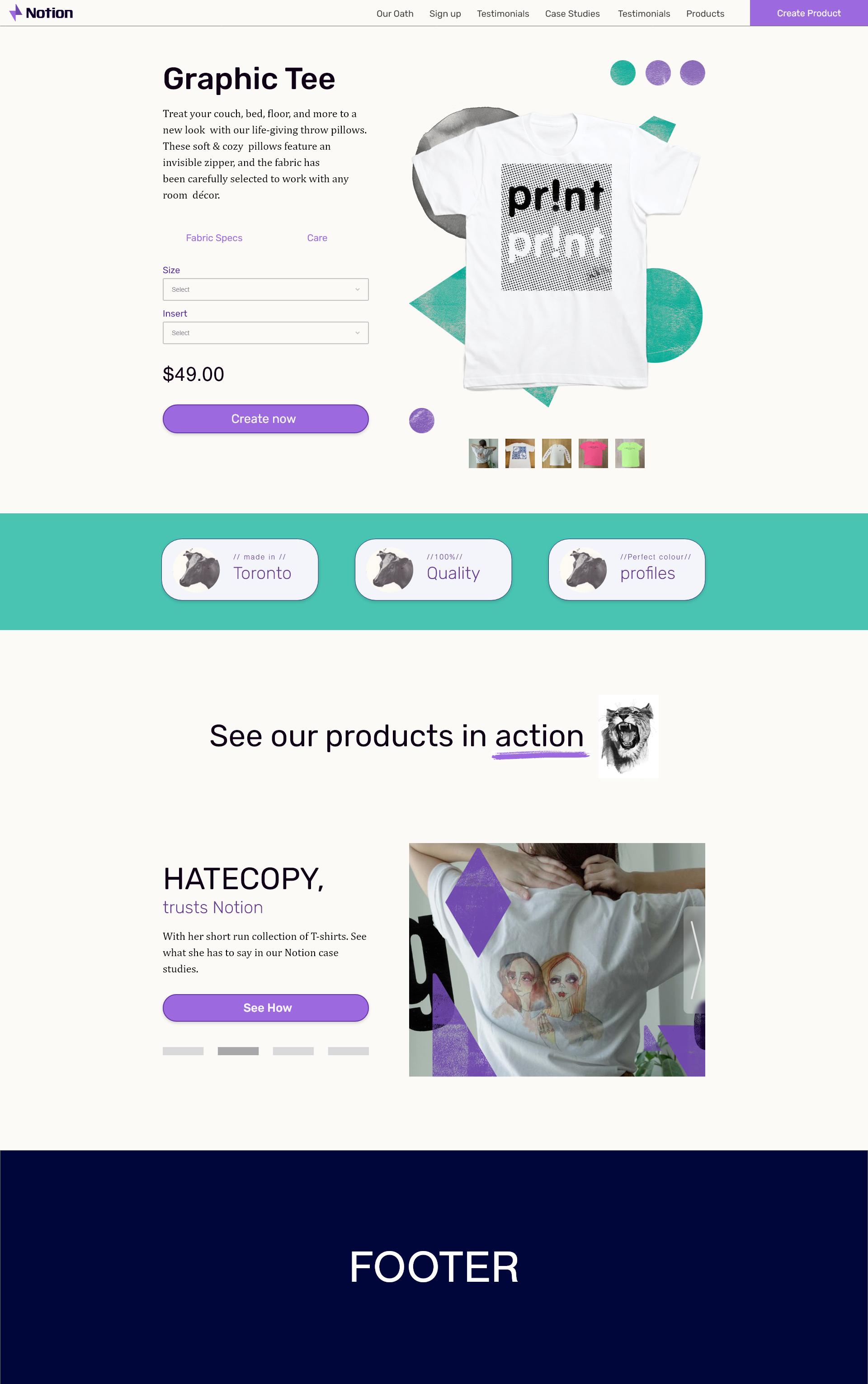
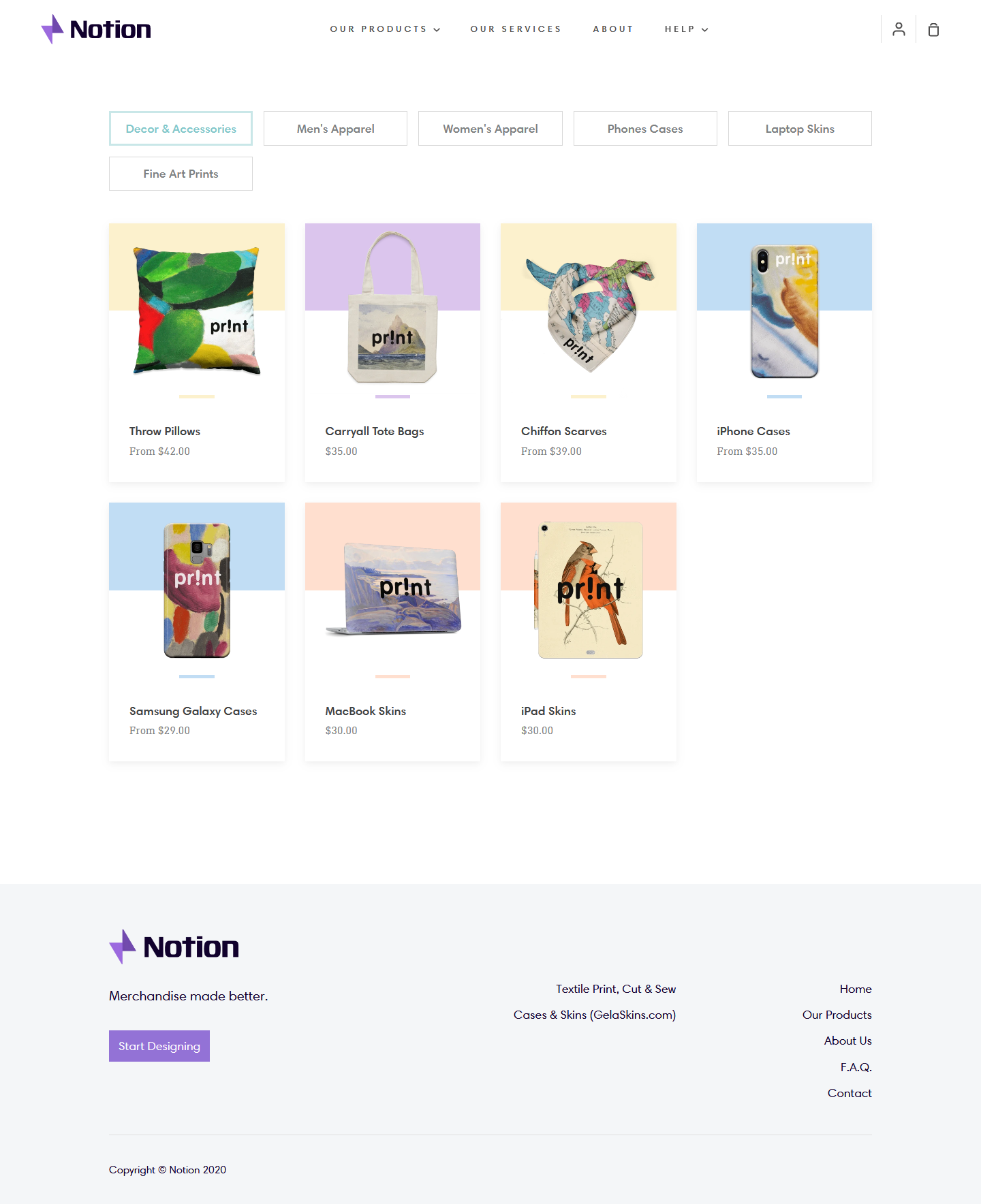
Screen shots of the end product. More details about my design reasoning too be added soon.


Post Mortem
Coming Soon!